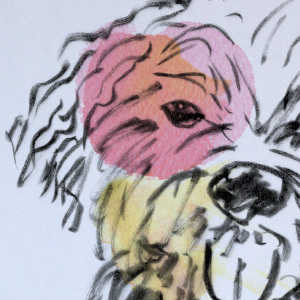
Amazon Freight / In the Wild
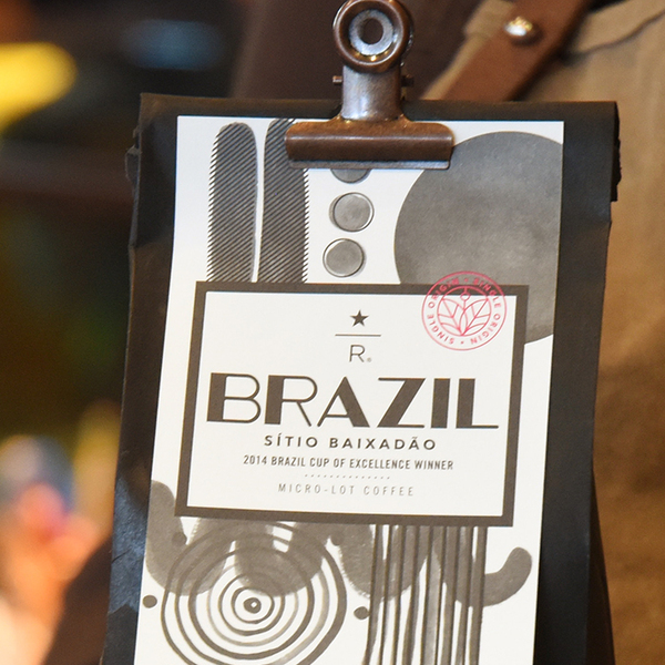
Starbucks / Packaging

Amazon Relay / Carrier Video
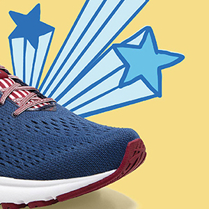
Brooks Running / 4th of July Campaign

Amazon Relay / Brand Guide

Amazon Freight / Ads & Collateral

Amazon Relay & Freight Brand Exploration
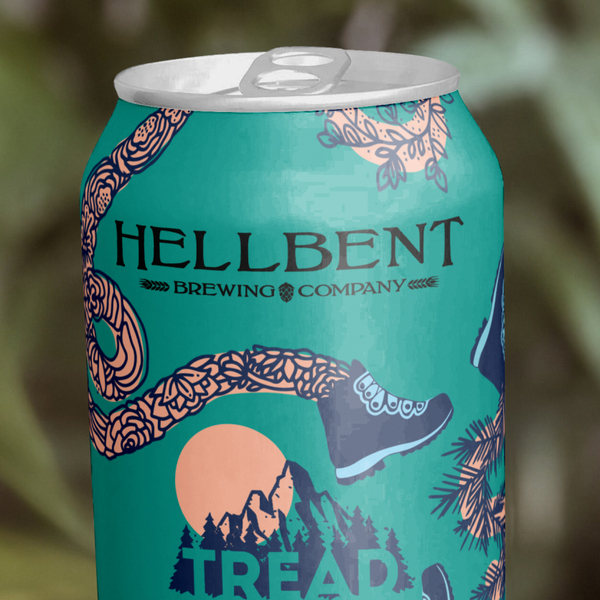
Hellbent + Tread Beer Label Contest

Amazon Relay / Various Events

Amazon Relay / Brand Video
Brooks / Events & Stuff
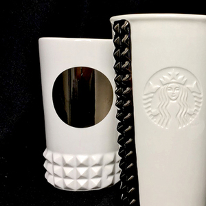
Starbucks / Merchandise
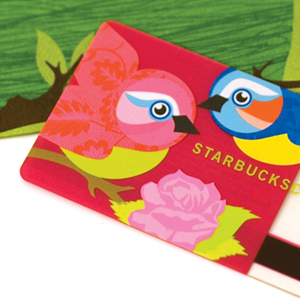
Starbucks / Gift Card
Amazon Go / Summer Campaign
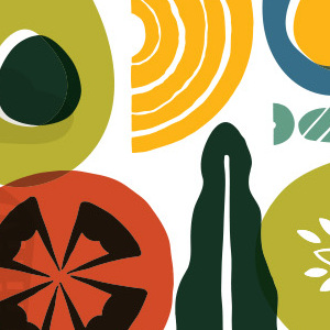
Amazon Go / Brand Guide
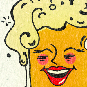
South Town Pie / Branding

Brooks Running / New Year New You Campaign
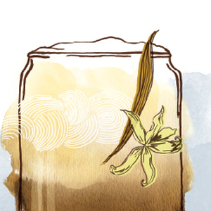
Starbucks / Summer Campaign
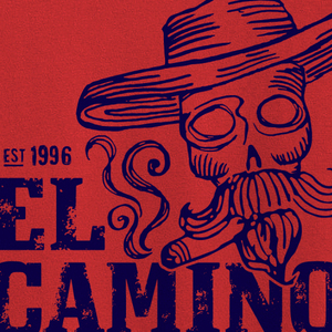
El Camino / Branding
Curious Toast / Branding

Amazon Relay / Awareness Campaign
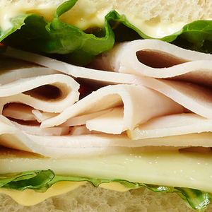
Amazon Go / Social Channel Launch and Strategy Revamp

Cure Therapy / Branding

Compendium / Journal Design
Queen's Court / Branding
OT Circus / Branding
